Lengana
A ground-up brand identity for a small-batch African botanical gin — from logo and label design to the marketing materials that carry it to market.
Lengana came to me as a small-batch African botanical gin with nothing yet on the shelf. I designed the brand from the ground up — the wordmark, the botanical line-art mark, and the label system for the bottle itself — before carrying that identity into the moments where Lengana meets its audience directly: on a show floor, on a screen, and in the mail.
Every touchpoint carries the same “Modern Apothecary” language: deep forest green, aged copper, and the engraved botanical motif drawn from the Lengana plant itself, so the logo on a bottle label and the logo on a business card read as unmistakably the same brand.
A system built to travel.
Where I focused.
Logo & Brand Identity
Designed the Lengana wordmark and botanical line-art mark, along with the colour, type and material palette that defines the brand.
Label Design
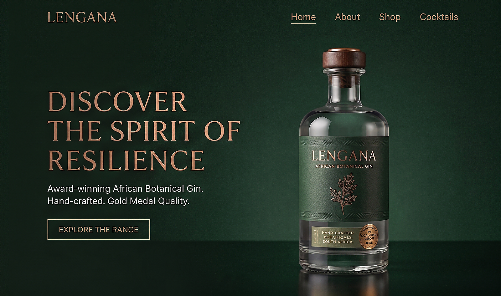
Designed the bottle label system, from the copper foil finish to the hand-crafted, small-batch signifiers on the neck seal.
Exhibition Booth Concept
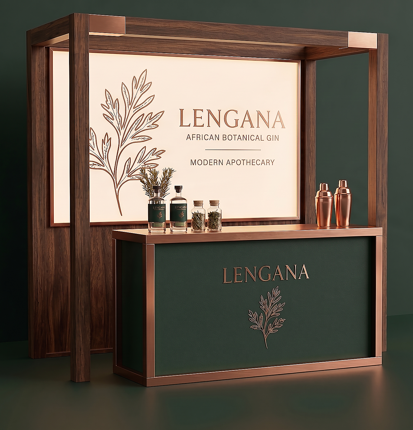
A modular walnut-and-copper bar concept with backlit signage and the engraved botanical motif, designed for shelf-stopping presence on a show floor.
Website Landing Page
A desktop landing page that carries the packaging’s dark, copper-lit aesthetic into a digital storefront built around the product shot.
Stationery Suite
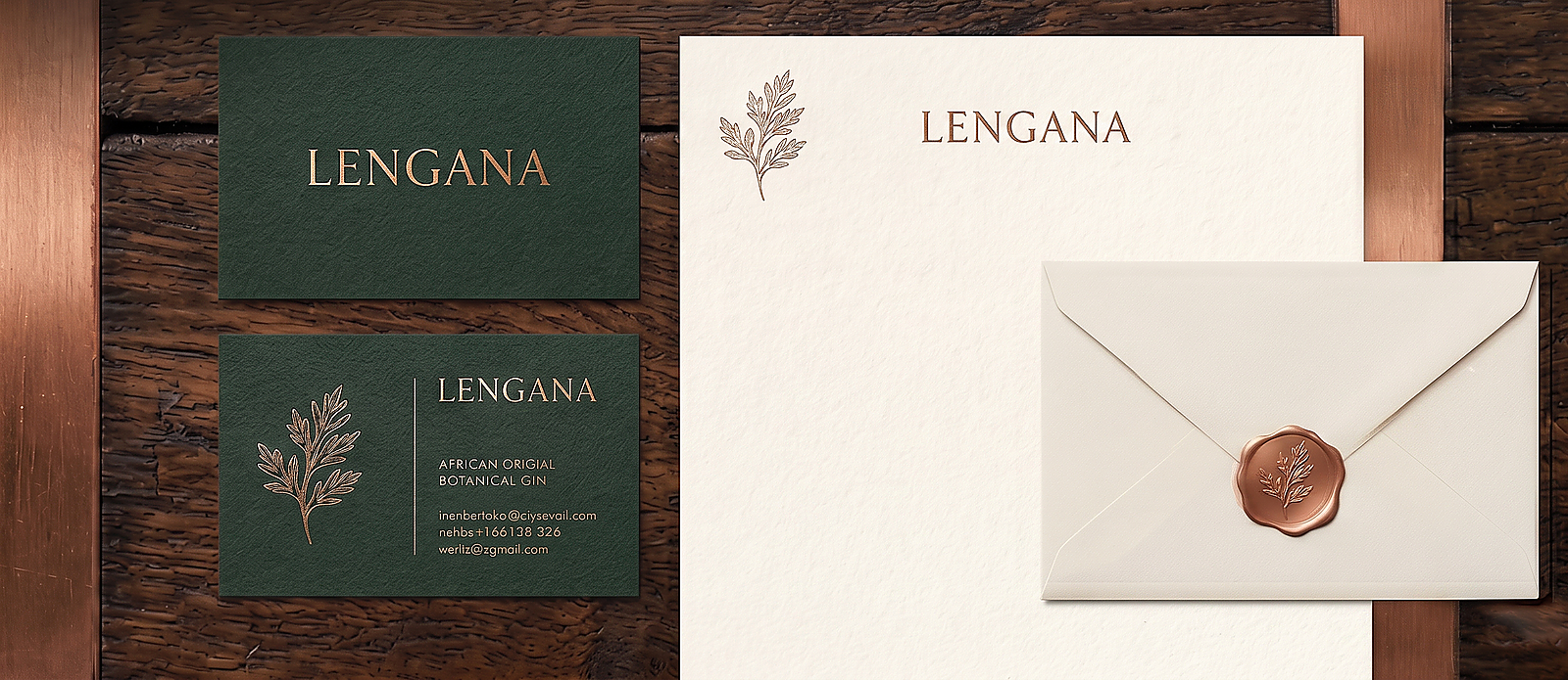
Business cards, letterhead and a wax-sealed envelope finished in the same botanical line-art and copper foil as the bottle label.
What it delivered.
One cohesive identity, designed from the logo outward, now spans packaging, trade presence, digital and print.
A booth concept ready to brief to an exhibition fabricator ahead of Lengana’s next trade show.
A label system, stationery suite and web landing page that all read as the same considered brand, on or off the shelf.