Kraut Attorneys
A full rebrand and website redesign for a specialist South African immigration law firm — built to feel as precise, considered and trustworthy as the legal advice it represents.
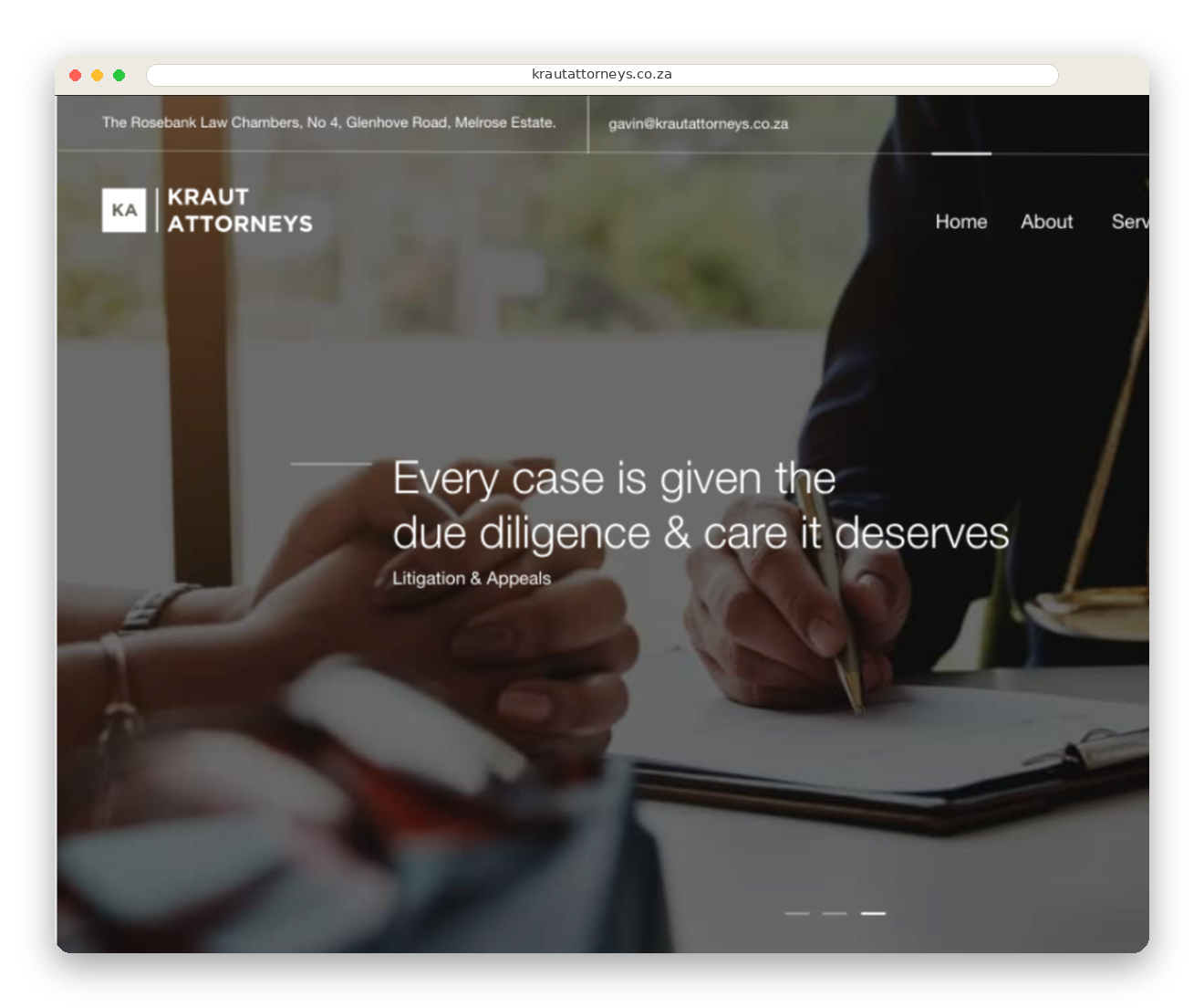
A digital presence built to match the seriousness of the work.
Kraut Attorneys is a boutique immigration law practice in Sandton, built on the reputation of founding partner Gavin Kraut and his years of experience in South African immigration and refugee law. The brief was to give a specialist legal practice a digital presence that matched the seriousness of the work.
I built a full identity system around the firm’s monogram, paired with a website structured around how prospective clients actually search for help: services, then process, then contact — reducing the distance between a visitor’s question and a consultation enquiry.
Precision, reduced to a mark.
The identity began with the firm’s initials, K and A, reduced to a compact square monogram. The goal was to create something recognisable without relying on familiar legal symbols such as columns, gavels or scales.
I explored contrast, reversal and the relationship between the monogram and wordmark across light, mid-tone and dark applications. The final system can work as a standalone KA tile or as a complete lock-up, retaining clarity from a website header to a business card.
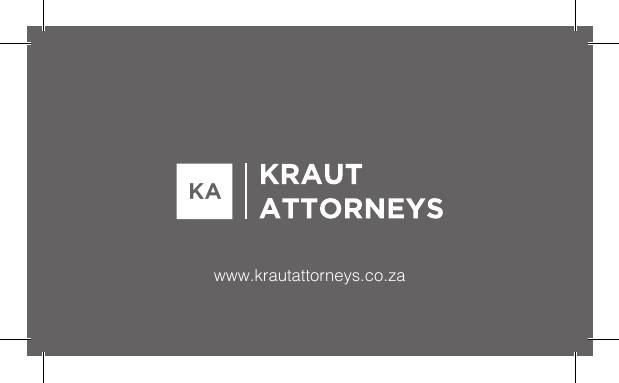
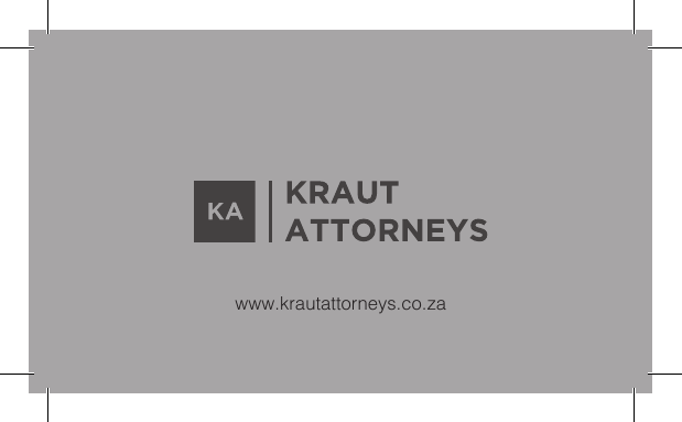
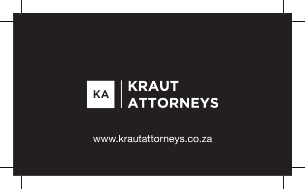
Four clear journeys, one calm interface.
The website was structured around the questions a prospective client asks first: what does the firm specialise in, can it help with my matter, who will handle it, and how do I make contact?
A consistent navigation pattern, restrained typography and image-led page headers create continuity across the experience. The hierarchy moves from reassurance to detailed services and finally to a low-friction enquiry path, making complex legal information easier to scan and act on.
Find the right service
Practice areas are organised in plain language so visitors can self-select quickly.
Build confidence
About and service content establish expertise before asking for an enquiry.
Reduce friction
Contact details and a focused form are easy to reach from every key page.
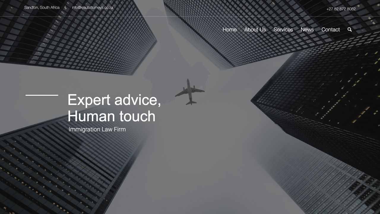
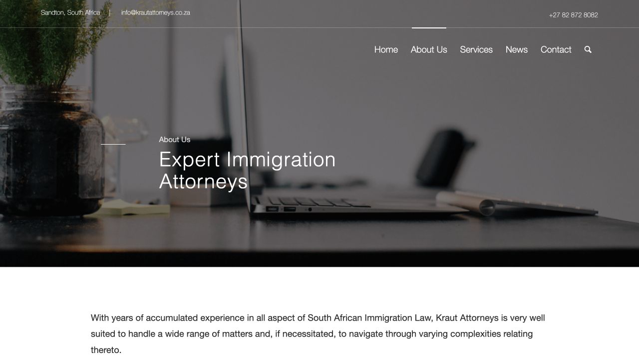
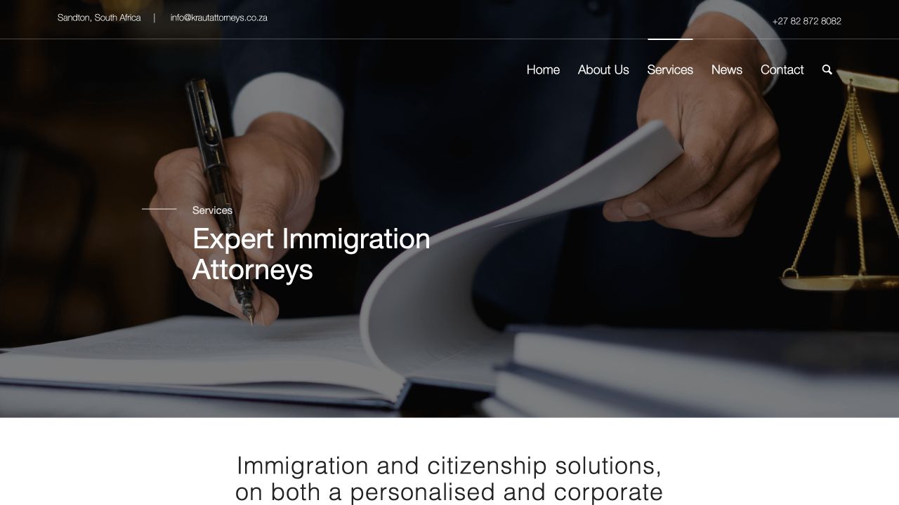
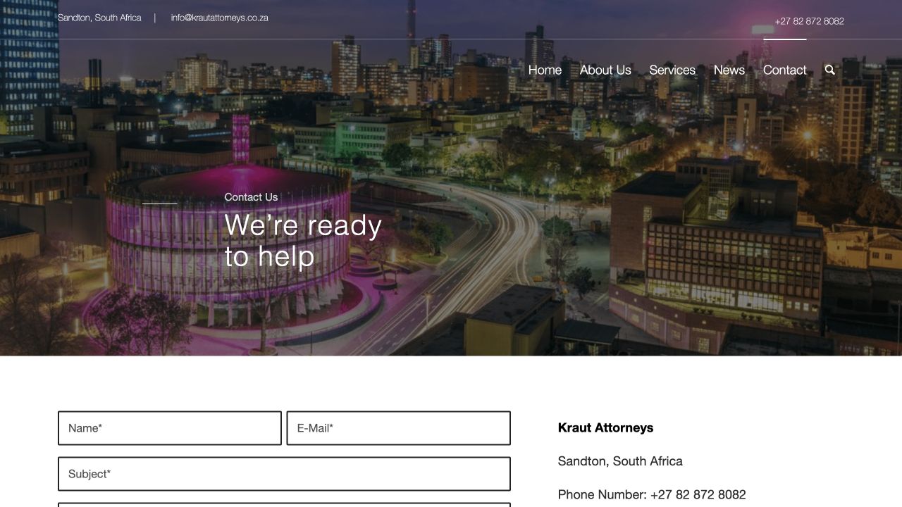
Where I focused.
Brand Identity & Monogram
Designed the “KA” monogram lockup and wordmark used across the site and stationery, giving the firm a distinct mark within a crowded legal sector.
Website Design & Build
Structured the site around immigration services, litigation & appeals, and citizenship — so prospective clients can find the right service without wading through legal jargon.
Content & Messaging
Worked directly with the firm to translate complex practice areas into plain-language service pages that build trust before the first consultation.
Responsive Development
Built and tested across devices, since a large share of enquiries into a legal practice begin on mobile.
What it delivered.
Gave a single-partner practice a visual identity that reads as credible to corporate and individual clients alike.
Replaced a generic template presence with a site purpose-built around the firm’s actual service offering.
Created a foundation the practice has continued to build on as its services have expanded.